Boxraw Website

Boxraw Website UX Optimization
Enhancing User Flows and Reducing Friction for a More Intuitive Shopping Experience
Project Overview:
Boxraw is a premium boxing lifestyle brand with a strong global presence, serving a dedicated community of boxers, athletes, and fitness enthusiasts who live by the values of discipline, resilience, and growth. As both a UX designer and a long-time customer, I brought firsthand experience to this project — not just of the brand, but of the friction points users encounter in real-world interactions with the site.
Challenge:
Boxraw’s website needed to evolve to meet the expectations of a growing customer base. While the visual identity was strong, the user experience presented friction across key flows — particularly around product discovery, navigation clarity, and the checkout process. The challenge was to reduce cognitive load and streamline the user journey, without compromising the brand’s premium positioning or visual integrity.
Approach:
I took a user-centered approach rooted in empathy, observation, and iterative design. I mapped the existing user flows, identified bottlenecks through heuristic evaluation, and prioritized areas where small UX improvements could create significant impact. My focus was on restructuring navigation, simplifying interactions, and improving clarity at key decision points — all while ensuring the experience reflected the strength and identity of the brand.
Backing the UX with Data
To better understand how users interact with Boxraw’s digital experience, I pulled in key data points across traffic, engagement, and customer sentiment. The goal here wasn’t just to showcase numbers, but to highlight patterns—where the site is performing well, where it’s adding value post-purchase, and where there’s room to improve.
These insights help ground the UX analysis in real-world behavior and make sure design decisions are backed by evidence, not assumptions.
1. Traffic Growth and Visibility
Boxraw’s monthly paid traffic has grown by 144% over the past year, putting it in the top percentile for category growth. This signals strong momentum in digital reach and brand awareness.
Source: info.charm.io

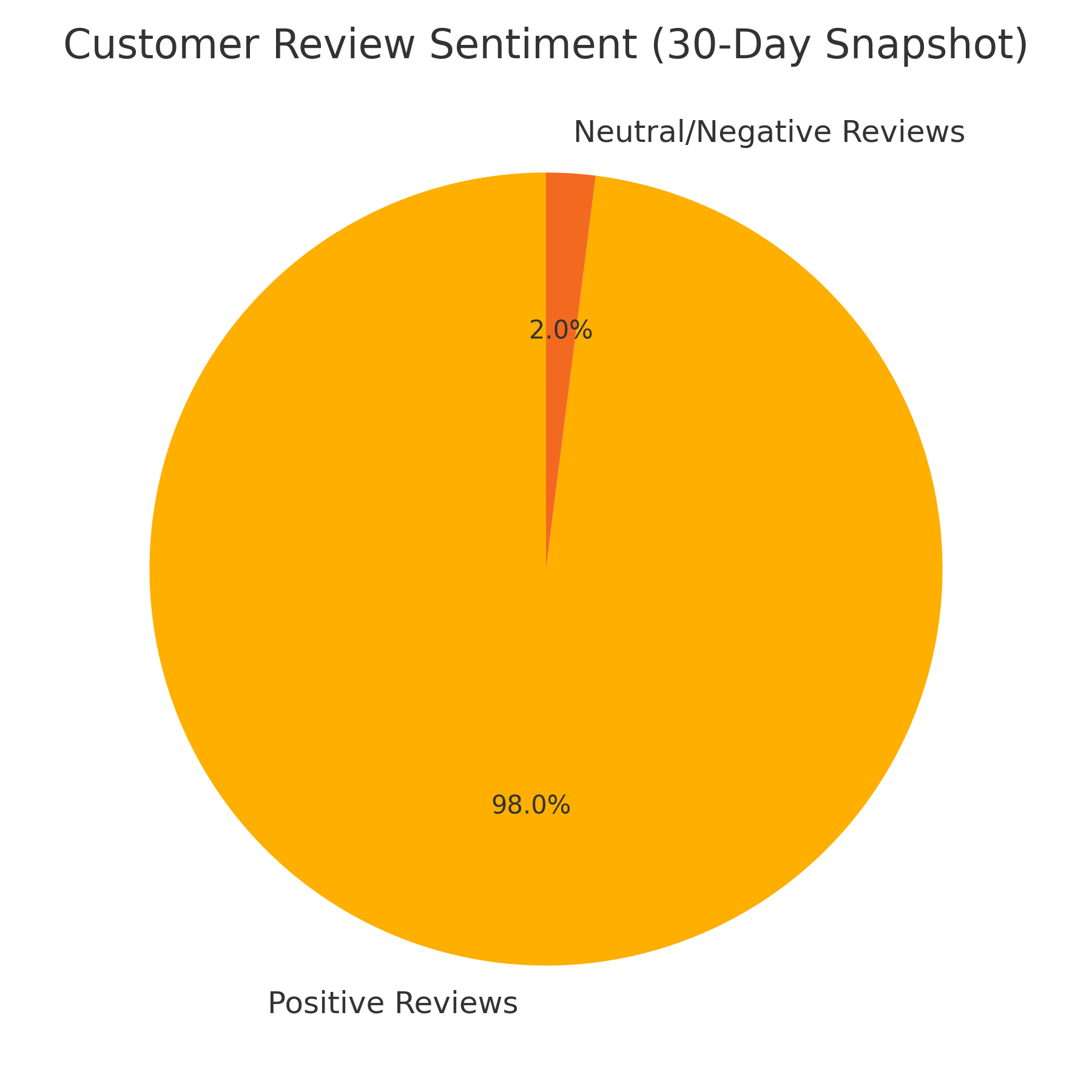
2. Customer Sentiment
Recent data shows that 98% of customer reviews over a 30-day period were positive—many called out fast delivery and reliable service as standout strengths.
Source: reviews.io
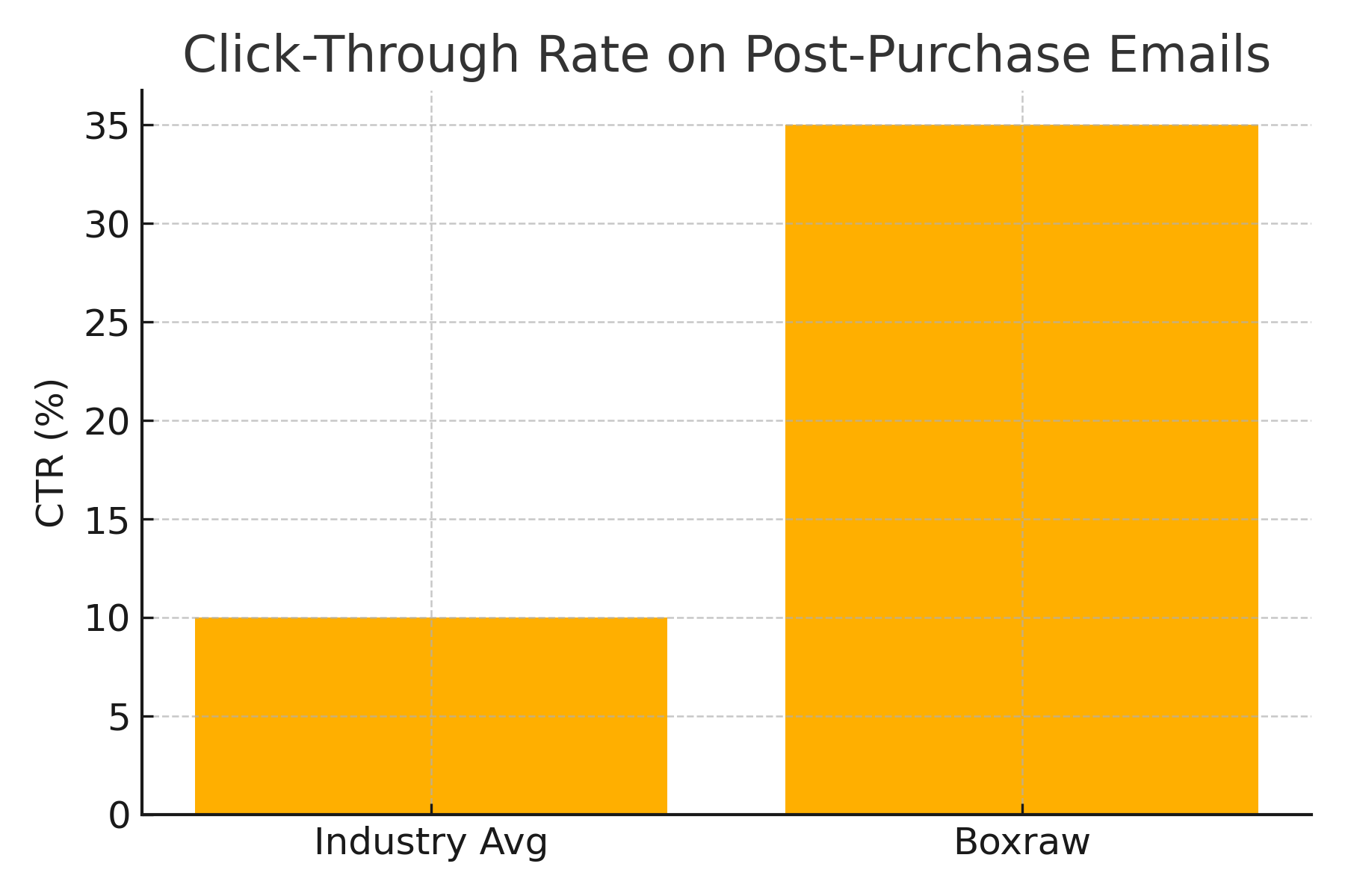
3. Post-Purchase Engagement
Boxraw’s post-purchase emails (powered by Shipup) see a 35% click-through rate, making them one of the brand’s top revenue drivers. This shows how well-crafted communication can keep the user journey going even after checkout.
Source: shipup.co
What This Means for UX
- Building Trust Through Transparency
- The use of verified reviews and address validation tools doesn’t just improve logistics—it adds a layer of trust that’s clearly resonating with customers
- Post-Purchase Touchpoints Matter
- Branded emails aren’t just functional; they’re revenue-generating experiences. Maintaining brand tone and clarity after checkout is paying off
- Social as a Conversion Funnel
- Boxraw’s high engagement on Instagram isn’t just for show. It plays a real role in driving traffic and supporting community-led growth
Source: SpeakRJ Instagram Stats
Why This Project Made Sense
Boxraw is already performing at a high level. Traffic is strong, customer sentiment is positive, and their post-purchase experience is clearly driving revenue. But strong performance doesn’t mean there’s no friction—it just means the problems are quieter.
As I worked through the site, I found small UX issues that could easily be overlooked, but still affect clarity, confidence, and conversion. These aren’t deal-breakers, but they do create unnecessary resistance in the user journey. And in fast-growing brands, that friction tends to scale right alongside everything else.
That’s why I chose to take on this project. Not to fix what’s broken, but to refine what’s already working—before the cracks start costing momentum. The following analysis outlines where the user experience could be stronger, and how small, targeted changes could create a more seamless, high-converting flow.